
Explore the fascinating world of color psychology in home design, where hues influence mood and atmosphere. Discover how different colors can evoke emotions and transform living spaces into vibrant reflections of personal style and aesthetics.
Choosing the Right Colors for Your Mood
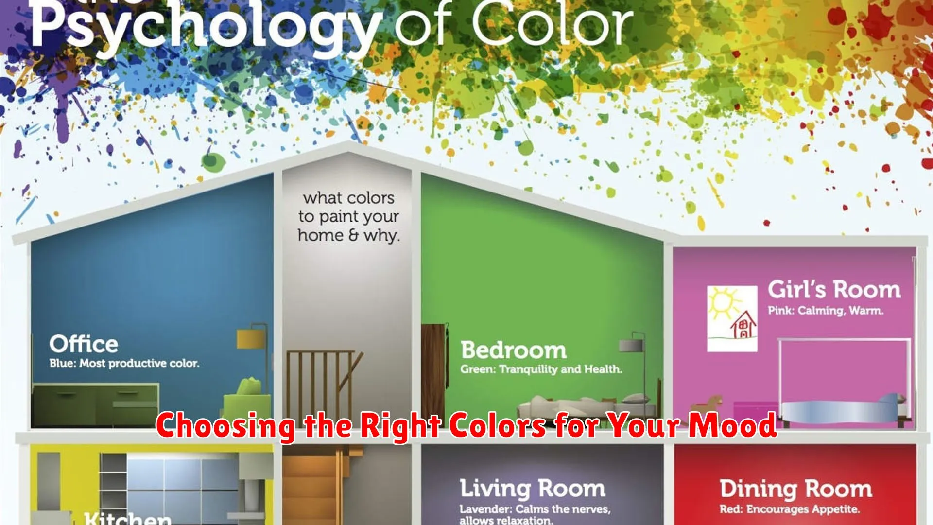
When it comes to home design, color plays a crucial role in setting the mood and atmosphere of a space. Understanding the psychology of color can help homeowners make informed decisions when selecting hues for their living environment. Here are some key points to consider when choosing the right colors to match your mood:
The Impact of Warm Colors
Warm colors such as red, orange, and yellow are known to evoke feelings of energy, warmth, and vitality. These hues can be great choices for social areas like living rooms or dining spaces where you want to create a welcoming and lively ambiance.
The Soothing Effect of Cool Colors
On the other hand, cool colors like blue, green, and purple are often associated with tranquility, relaxation, and serenity. These shades work well in bedrooms or home offices where a calm and peaceful environment is desired.
The Versatility of Neutral Colors
Neutral colors such as white, beige, and gray serve as excellent foundations in home design. They provide a sense of balance and can complement both warm and cool color schemes. Neutrals are a safe choice for creating a timeless and elegant look in any room.
Personal Preferences and Emotional Responses
It’s important to consider your own personal preferences and emotional responses to different colors. Pay attention to how specific hues make you feel and choose colors that positively impact your mood and well-being.
By selecting the right colors for your home based on their psychological effects, you can create a living space that not only looks aesthetically pleasing but also nurtures your overall mood and emotions.
Color Schemes for Productivity and Relaxation
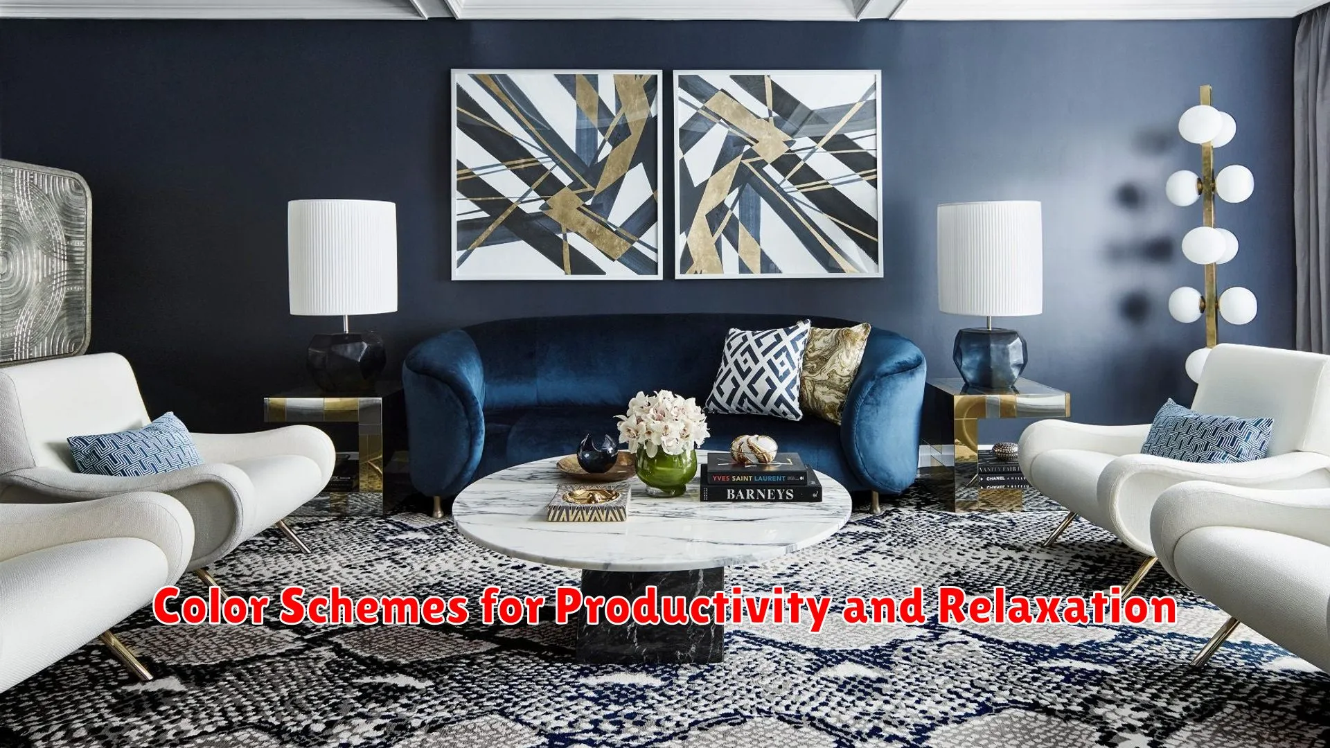
When it comes to home design, selecting the right color scheme plays a significant role in creating a space that promotes both productivity and relaxation. Different colors have the power to impact our moods and behaviors, making it essential to choose wisely for each room in your home.
The Psychology of Productivity
For areas in your home where productivity is key, such as home offices or study spaces, opt for colors like blue and green. Blue is known for enhancing focus and efficiency, while green can foster a sense of harmony and balance, ideal for tasks that require concentration.
Calmness and Relaxation
On the other hand, for spaces dedicated to relaxation and unwinding, consider soothing neutrals like soft beige and light grey. These colors create a serene atmosphere, promoting a sense of calm and tranquility after a long day.
Accent Colors and Balance
To add depth and visual interest to your space, incorporate accent colors strategically. Warm tones like yellow and orange can inject energy into a room, while cool tones like purple and teal offer a sense of relaxation when used sparingly.
By understanding the psychology of color and its impact on our emotions, you can create a home environment that not only reflects your style but also nurtures productivity and relaxation effectively.
Implementing Color with Purpose
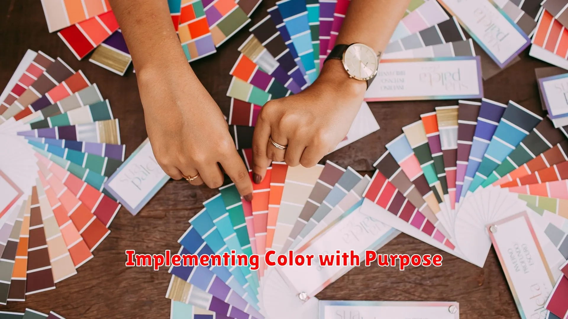
Color plays a crucial role in home design as it can impact our emotions, mood, and overall well-being. When it comes to the psychology of color, each hue has a unique effect on individuals, making it essential to implement color with purpose in your living space.
Understanding the psychology of colors: Different colors evoke diverse emotions and reactions. For example, blue is known for its calming effect and is ideal for bedrooms or relaxation areas. On the other hand, yellow can bring energy and positivity, making it suitable for kitchens or workspaces.
Creating harmony: Consider the overall ambiance you want to achieve in each room and choose a color scheme that aligns with that vision. Utilize a combination of warm and cool tones to create balance and harmony within your home design.
Accent colors: Use accent colors strategically to highlight specific features or elements in a room. Bold colors can add a pop of personality, while neutrals provide a timeless and elegant backdrop.
Personal preference: While understanding color psychology is essential, it’s also crucial to consider your personal preferences and how different colors make you feel. Your home should reflect your personality and style, so choose colors that resonate with you.
Conclusion
Choosing the right colors in home design is crucial as they can significantly impact mood and atmosphere. By understanding the psychology of color, homeowners can create spaces that promote well-being and evoke desired emotions.


